Simple Linear Regression
Jazz Peh, May 05, 2020
Let’s explore how we can implement Simple Linear Regression in this post.
Firstly let’s take a look at the dataset used.
Data.csv
YearsExperience,Salary
1.1,39343.00
1.3,46205.00
1.5,37731.00
2.0,43525.00
2.2,39891.00
2.9,56642.00
3.0,60150.00
3.2,54445.00
3.2,64445.00
3.7,57189.00
3.9,63218.00
4.0,55794.00
4.0,56957.00
4.1,57081.00
4.5,61111.00
4.9,67938.00
5.1,66029.00
5.3,83088.00
5.9,81363.00
6.0,93940.00
6.8,91738.00
7.1,98273.00
7.9,101302.00
8.2,113812.00
8.7,109431.00
9.0,105582.00
9.5,116969.00
9.6,112635.00
10.3,122391.00
10.5,121872.00| YearsExperience | Salary |
|---|---|
| 1.1 | 39343.00 |
| 1.3 | 46205.00 |
| 1.5 | 37731.00 |
| 2.0 | 43525.00 |
| 2.2 | 39891.00 |
| 2.9 | 56642.00 |
| 3.0 | 60150.00 |
| 3.2 | 54445.00 |
| 3.2 | 64445.00 |
| 3.7 | 57189.00 |
| 3.9 | 63218.00 |
| 4.0 | 55794.00 |
| 4.0 | 56957.00 |
| 4.1 | 57081.00 |
| 4.5 | 61111.00 |
| 4.9 | 67938.00 |
| 5.1 | 66029.00 |
| 5.3 | 83088.00 |
| 5.9 | 81363.00 |
| 6.0 | 93940.00 |
| 6.8 | 91738.00 |
| 7.1 | 98273.00 |
| 7.9 | 101302.00 |
| 8.2 | 113812.00 |
| 8.7 | 109431.00 |
| 9.0 | 105582.00 |
| 9.5 | 116969.00 |
| 9.6 | 112635.00 |
| 10.3 | 122391.00 |
| 10.5 | 121872.00 |
Math expression
- y =
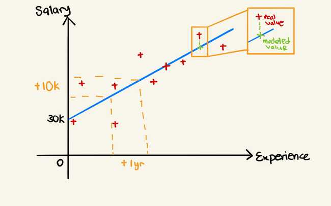
dependent variable (DV)-The column that is being predicted. - b0 =
constant- Point where the line crosses the vertical axis. - b1 =
coefficient- Slope of the line. - x1 =
independent variable (IV)- Also known as the features; are the columns which are being used to predict the dependent variable.
Salary is the column that we want to predict, and hence it is the dependent variable. YearsExperience is the column used to predict the dependent variable and hence it is the independent variable. Hence, the formula will translate to Salary = b0 + b1*YearsExperience.
Chart drawing example
Code example
Firstly, we need to import the dataset. Check out my post on Data preprocessing to get the step by step guide on how to do so.
Why didn’t we apply Feature Scaling in our Simple Linear Regression model?
It’s simply because since y is a linear combination of the independent variables, the coefficients can adapt their scale to put everything on the same scale. For example if you have two independent variables x1 and x2 and if y takes values between 0 and 1, x1 takes values between 1 and 10 and x2 takes values between 10 and 100, then b1 can be multiplied by 0.1 and b2 can be multiplied by 0.01 so that y, b1x1 and b2x2 are all on the same scale.
Training the Simple Linear Regression model on the training set
scikit-learn to the rescue. They made it super simple to train model. Just 3 lines of code.
from sklearn.linear_model import LinearRegression
regressor = LinearRegression()
regressor.fit(x_train, y_train)
What does ’regressor.fit(Xtrain, ytrain)’ do exactly?
The fit method will take the values of Xtrain and ytrain and then will compute the coefficients b0 and b1 of the Simple Linear Regression equation (y = b0 + b1x). That’s the whole purpose of this fit method here.
To learn more about
scikit-learn’s LinearRegression class, check out their docs.
Predicting the Test set results
y_pred = regressor.predict(x_test)

print(y_pred)
# [ 40748.96184072 122699.62295594  64961.65717022  63099.14214487
#  115249.56285456 107799.50275317]
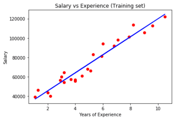
Visualising the Training set results
matplotlib makes it super easy to visualise in a chart. We’re using the scatter method here to view the results in a scatter chart.
plt.scatter(x_train, y_train, color='red')
plt.plot(x_train, regressor.predict(x_train), color='blue')
plt.title('Salary vs Experience (Training set)')
plt.xlabel('Years of Experience')
plt.ylabel('Salary')
plt.show()
To learn more about
matplotlib scattermethod, check out their docs
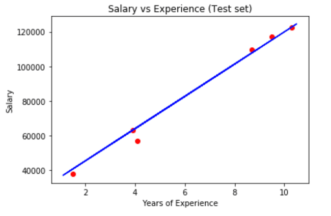
Visualising the Test set results
I need to point out that we’re using back our x_train instead of x_test in the predict method for the regressor. This is because, we are testing it against the training model and not the test model.
plt.scatter(x_test, y_test, color='red')
plt.plot(x_train, regressor.predict(x_train), color='blue')
plt.title('Salary vs Experience (Test set)')
plt.xlabel('Years of Experience')
plt.ylabel('Salary')
plt.show()

